

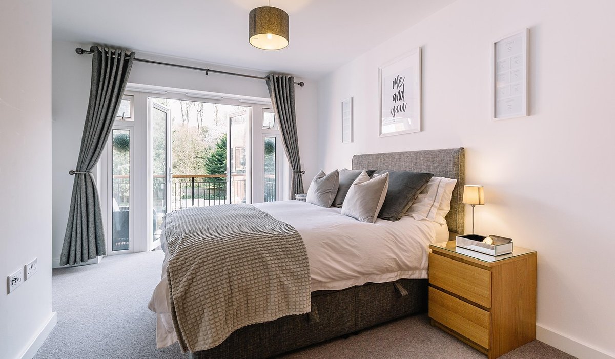
Choosing Warm Neutrals for a Cottage Sitting Room
A cottage sitting room has its own rhythm. Low beams, uneven walls and windows that frame the garden all ask for a scheme that works with the building. Warm neutrals — gentle creams, soft taupes, oatmeal and stone — reflect what light there is, flatter old timbers and create a room that feels calm in January and airy in July.
Why Warm Neutrals Suit a Cottage Sitting Room
Old cottages rarely have wide, south-facing windows. Light often arrives filtered through small panes or bounces off a north-facing garden. A cool grey or brilliant white can turn that light cold. Warm neutrals hold a hint of yellow, red or green, so walls feel sunlit even on a drizzly afternoon. They also sit comfortably beside oak beams, brick inglenooks, flagstones and lime plaster.
The aim is not blandness. It is a backdrop that lets texture, shape and the view outside do the talking. A soft taupe wall makes a faded tapestry or a bowl of hedgerow flowers look intentional. A cream ceiling lifts a low room without shouting. In a cottage, restraint reads as generosity.
Building a Layered Palette of Creams, Taupes and Stone
Start with three or four related shades rather than one flat colour. Use a pale base for walls, a slightly deeper tone for woodwork, and a mid-tone for alcoves or the back of a bookcase. For example:
- Walls: soft oatmeal or pale limestone in a matt finish.
- Ceiling: off-white with a touch of grey or yellow, never stark white.
- Woodwork: greyed taupe or mushroom, one or two shades deeper than the walls.
- Accents: deeper stone or clay inside alcoves or behind shelves.
Test paint on large paper or board and move it around the room at different times of day. Cottage light changes dramatically between morning and late afternoon. A colour that looks chalky at noon can turn peach at sunset, which is often exactly what you want.
Choosing Paint Finishes for Old Walls
Many cottages need to breathe. If your walls are lime plaster, brick or stone, choose a breathable finish such as limewash, clay paint or traditional chalky emulsion. These let moisture move through the wall, helping prevent damp and flaking. Avoid vinyl silk on old walls; it traps moisture and highlights every bump.
For woodwork, water-based eggshell in a warm neutral is practical and wipeable. It gives a gentle sheen that catches lamplight without looking glossy. If you have original beams, think carefully before painting them. Bare or waxed timber adds warmth and contrast; if they must be painted, use the same neutral as the ceiling so they recede. In a damp cottage, allow walls to dry fully between coats and avoid plastic-based primers.
Natural Textures That Soften the Scheme
Warm neutrals come alive with texture. A room painted in similar tones can feel flat without variation underfoot, at the windows and on the furniture. Aim for at least three tactile elements:
- Underfoot: jute or sisal for durability, with a wool rug layered near the sofa.
- Windows: unlined linen curtains or a simple Roman blind in oatmeal.
- Seating: loose covers in washed cotton or linen, with wool throws and faded stripe cushions.
- Surfaces: aged wood, stone, terracotta, wicker baskets and a little worn leather or brass.
Keep patterns subtle. A small check, a faded floral or a woven stripe in similar tones adds interest without breaking the calm. If you have a busy view outside, let the garden be the pattern and keep fabrics quieter.
Lighting, Woodwork and Seasonal Adjustments
Lighting is where warm neutrals either sing or fall flat. Use several low-level lamps rather than one bright ceiling light. Choose warm white bulbs around 2700K and fit dimmers where you can. Linen or parchment shades cast a soft glow that flatters cream and taupe walls. In winter, add a table lamp in an alcove and a floor lamp beside a reading chair; in summer, let the windows do the work.
Seasonal tweaks keep the scheme fresh. In warmer months, replace wool throws with cotton or linen and swap heavy curtains for lighter ones. In autumn and winter, bring in deeper taupe cushions, a wool rug and perhaps a copper candlestick for gentle reflection. The walls stay the same; only the layers change. This is the great advantage of a neutral cottage palette — it adapts without repainting.
Practical Touches for Everyday Cottage Life
A sitting room must cope with muddy boots, dogs, log baskets and cups of tea. Choose washable loose covers for sofas and armchairs, and keep a basket of throws near the door for chilly evenings. Arm caps or a folded throw protect upholstery without looking precious. A large footstool in a neutral weave can double as a coffee table or extra seating.
Keep a small tin of touch-up paint in the same warm neutral for skirting boards and door frames. In a cottage, scuffs are part of the story, but a quick dab keeps the scheme looking cared for. Finally, let the room age gracefully. Warm neutrals improve with wear, sunlight and the gentle patina of country life. They are not a trend but a background for the way you actually live.


Home Interiors
-
Arrange everyday crockery, wooden utensils and small pots of herbs to keep open shelves useful, tidy and full of character.

Seasonal Cooking




-

Long established fact that a reader will be distracted
-

Long established fact that a reader will be distracted
-

Long established fact that a reader will be distracted




Cottage Gardening
Karla Gleichauf
12 May 2017 at 05:28 pm
On the other hand, we denounce with righteous indignation and dislike men who are so beguiled and demoralized by the charms of pleasure of the moment
M Shyamalan
12 May 2017 at 05:28 pm
On the other hand, we denounce with righteous indignation and dislike men who are so beguiled and demoralized by the charms of pleasure of the moment
Liz Montano
12 May 2017 at 05:28 pm
On the other hand, we denounce with righteous indignation and dislike men who are so beguiled and demoralized by the charms of pleasure of the moment